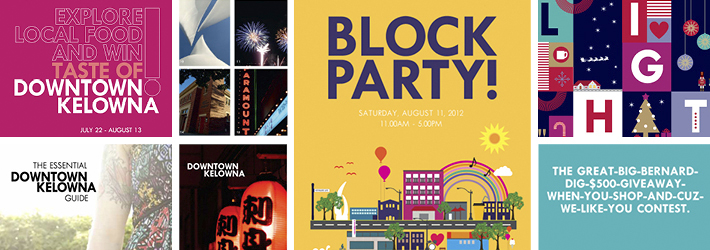
Downtown Kelowna is undergoing an urban renewal. After decades of hollowing out as people moved to the ‘burbs and businesses closed down or joined the strip malls along the highway, the last half dozen years or so have brought signs of light.
Beginning in fall 2012, a major construction and infrastructure project will completely redesign its main street (Bernard Ave.) bringing wider pedestrian walks, bike lanes and room for sidewalk patios. Eighteen months prior to the revitalization, the Downtown Kelowna Business Improvement Association (DKBIA) hired us to prepare for the inevitable turmoil major construction projects bring to businesses nearby.
The Interesting
Preconceptions were strong, and strongly negative. Before things got big-hole-in-the-ground-y, we needed to invite people to, literally, look again and see Downtown Kelowna in a new light. We started by curating photography from Flickr, gathering images from people who were already seeing Downtown Kelowna in an interesting light rather than commissioning work from a professional whose job it is to look on the bright side. We let the people define the place, not the professionals.
We combined the imagery with a simple, declarative ID, that didn’t try to define Downtown Kelowna to itself, but rather claim all that it is – the good, the bad and the ugly – as integral to its what defines it: a destination comfortable in its own skin.
The Design The MaterialsBrand Blueprint, Identity/Logo, Stationery Package, Signage, Event Concepts, Annual Report, Promotion Concepts, Trade Show Display, Collateral, and Print and Online Advertising.
